D.I.S.C.O. Design Jam Website
Duration: January 2025 - May 2025

What is the D.I.S.C.O.?
The D.I.S.C.O. is an acronym referencing the purpose of the design jam; our toolkit aims to help people experience. D.I.S.C.O. stands for:
Design an Inclusive Spaceship Collaborative Operation
The workshop was originally inspired by the "Design a Spaceship" essay from Uncanny Magazine. It’s a project co-created by Dr. Jessica FitzPatrick and DNID alum Lynn Priestley and backed by the University of Pittsburgh’s Digital Narrative and Interactive Design program and Digital Media Lab.
Project Roles
Web Developer, co-UX Designer, UX Researcher
Skills
Web Development, UX Design, UX Research, Wireframing, Prototyping
Toolkit
HTML/CSS, JavaScript, Figma
Phase I: Prototyping
Before I began developing this website, I assisted our accessibility coordinator, Julie, in creating our prototype for the website for web, mobile, and tablet devices. Using the color palette created by our Print Layout and Design Editor, Karlynn Ricitelli, we prioritized creating an accessible visual experience for our visitors.
Color Palette

Mockup/Prototype

The complete mobile high-fidelity prototype for the D.I.S.C.O. Design Jam website, created in Figma.
Phase II: Usability Testing
Using Google Forms and the System Usability Scale (SUS), I tested the site with nine peers to uncover design issues, evaluate navigation clarity, and track user focus.
Feedback
Situational Questions Feedback
While the design was generally intuitive, users found the “Facilitators” page title unclear. I updated it to “Leaders” for greater clarity and simplicity.
Design Questions Feedback
Users noted inconsistent margins and image layouts. I refined these elements to ensure visual consistency and improve overall appeal.
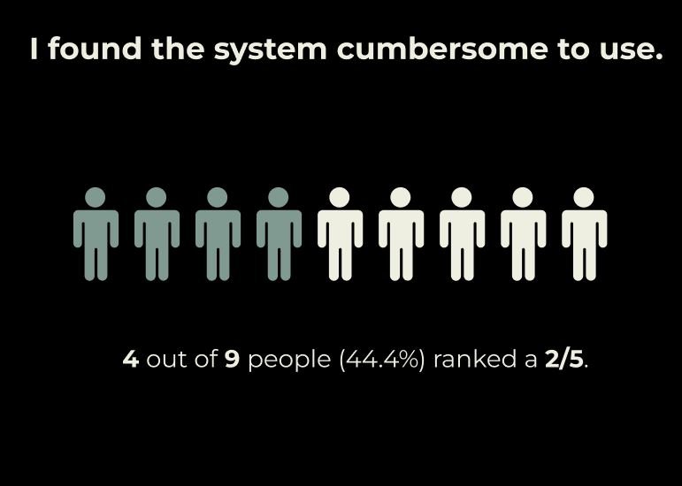
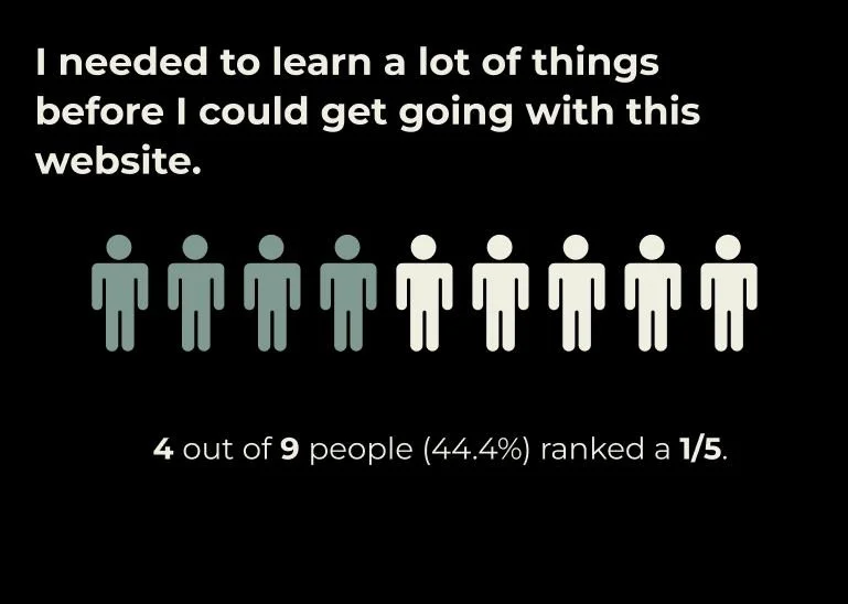
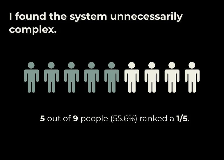
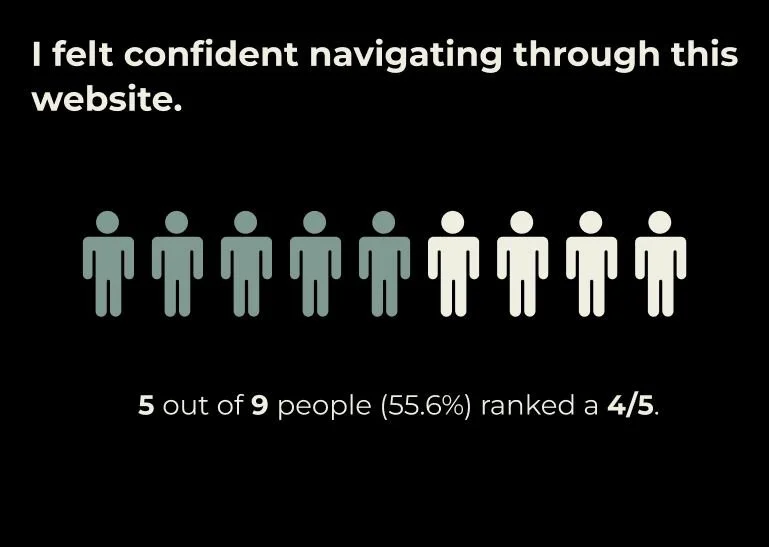
System Usability Scale (SUS)
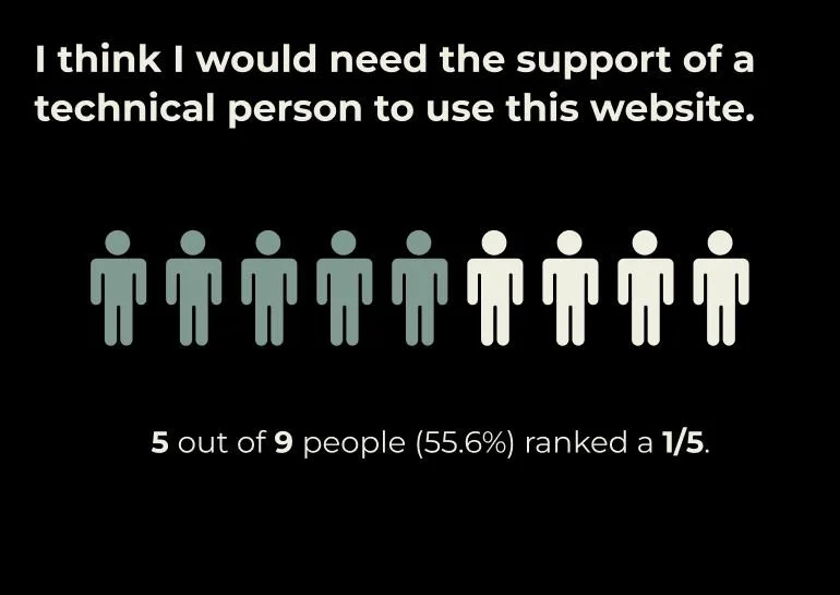
Using five questions from the System Usability Scale, I wanted to understand what users were feeling while navigating through the prototype to create a simpler and more user-friendly experience for users. The scale ranges from 1 (strongly disagree) to 5 (strongly agree).
Phase III: Website Development
After tweaks were made to the high-fidelity prototype based on user feedback, I began the development of the D.I.S.C.O. Design a Spaceship website using HTML/CSS and a bit of JavaScript.

Limitations & Key Takeaways
Conducting user research was tough, trying to find an appropriate time for myself and participants due to conflicting schedules within a week-long period.
Feedback given by users opened up my perspective to show how certain language can affect the user’s experience.
Iterating with users showed that less can be more when improving a user’s focus on tasks.
